
Decision
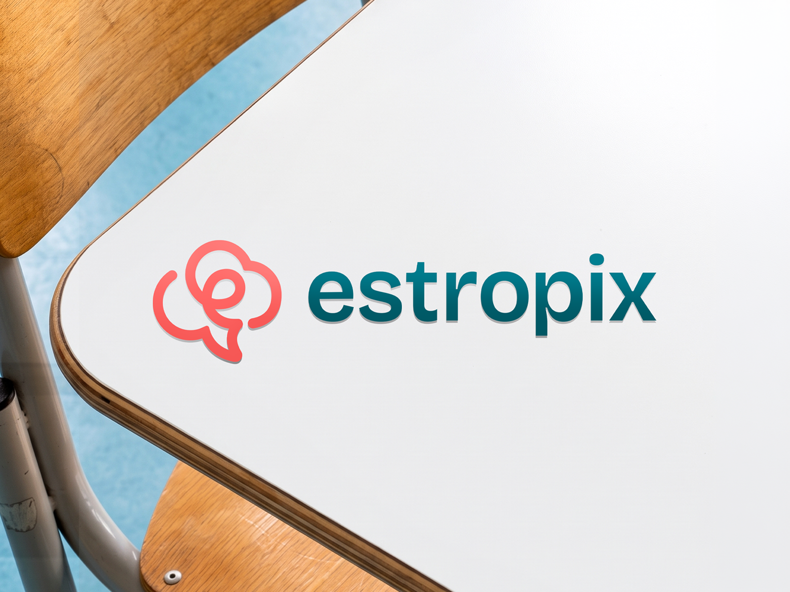
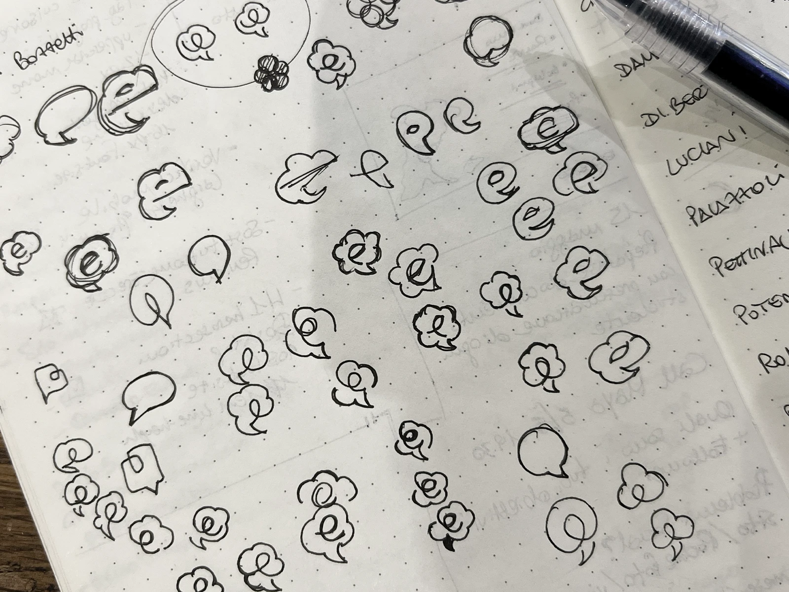
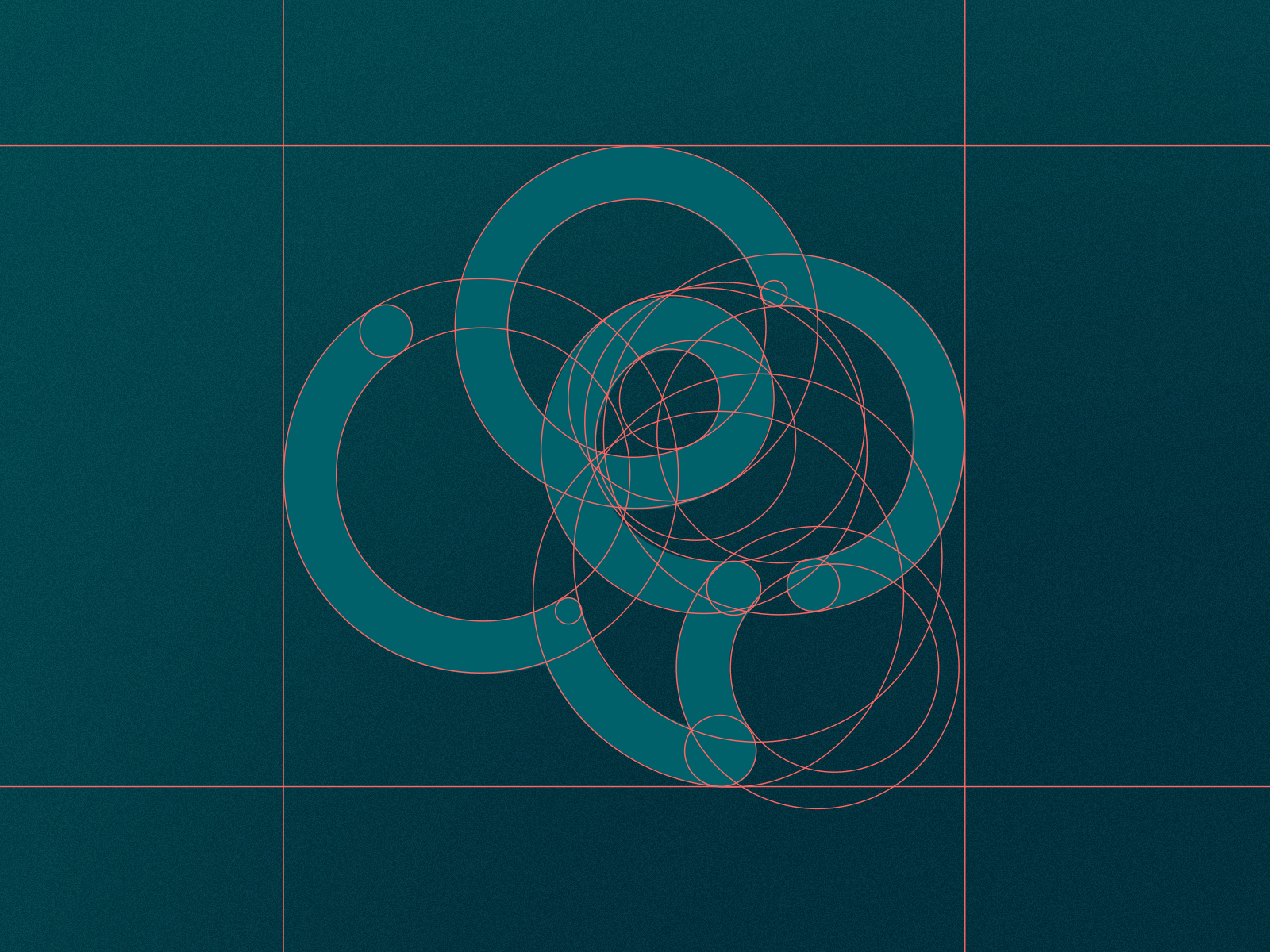
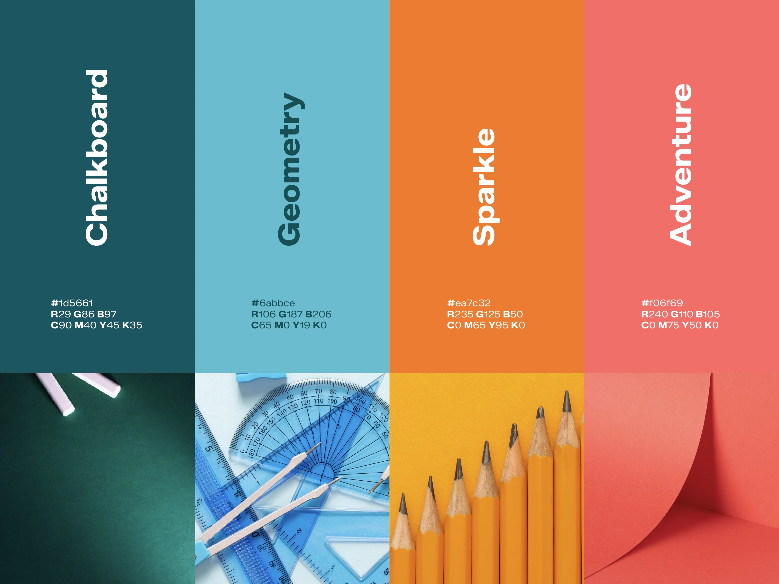
Starting from a competitor analysis and a color study built to serve two audiences at once — playful enough for children, credible enough for parents monitoring real progress — the identity took shape around a single graphic sign: a speech bubble reduced to one continuous stroke, forming the letter E. A sans-serif typeface with a distinct, modern ink-trap — deliberately direct rather than elegant — carries that same logic through every touchpoint.
Outcome
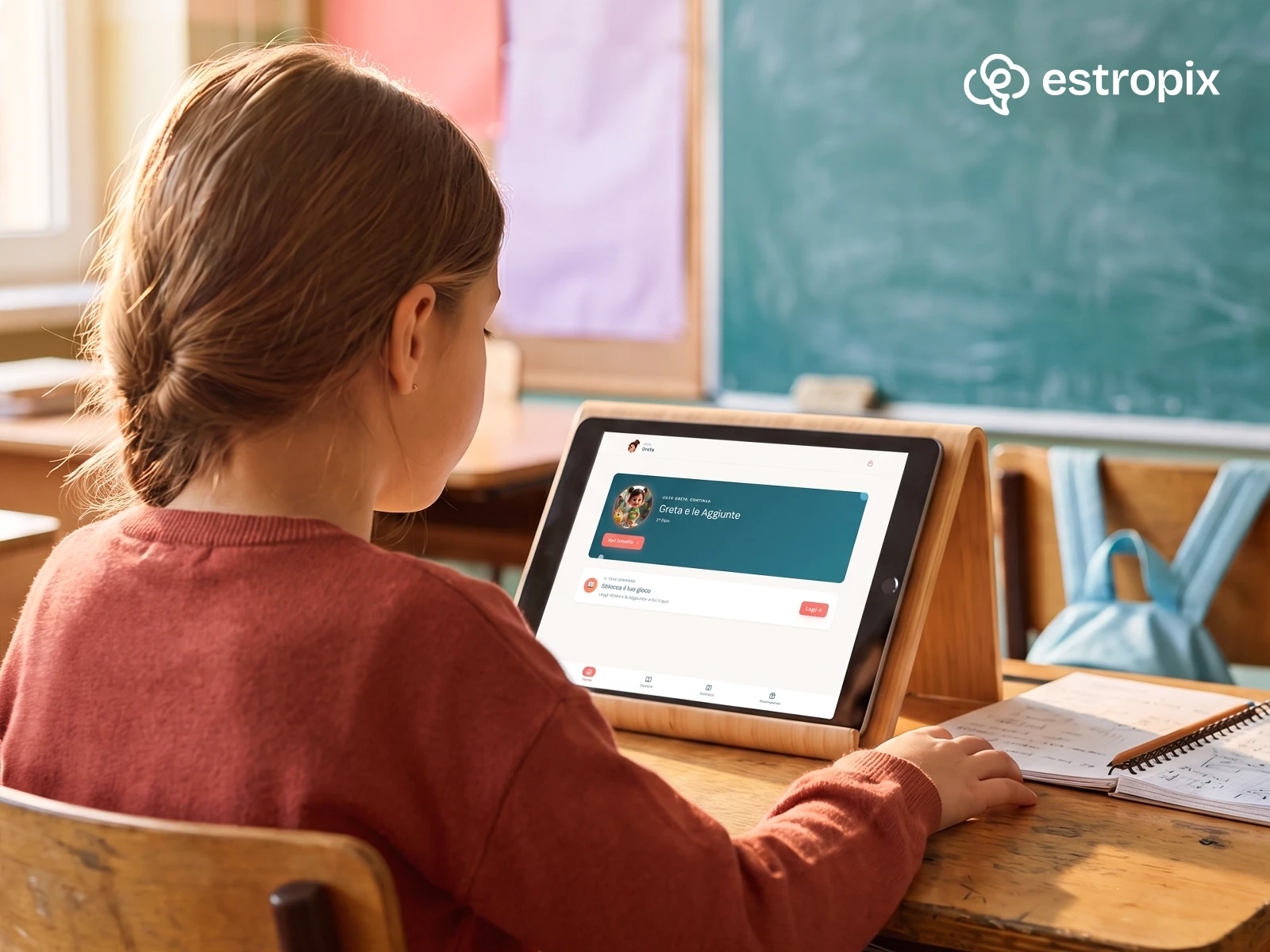
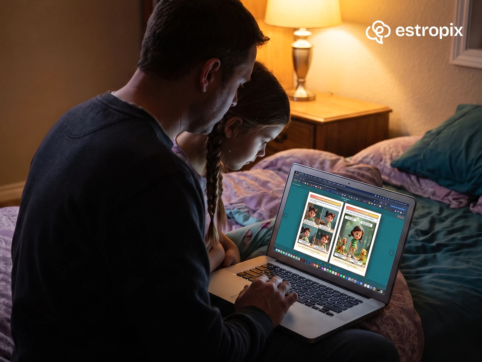
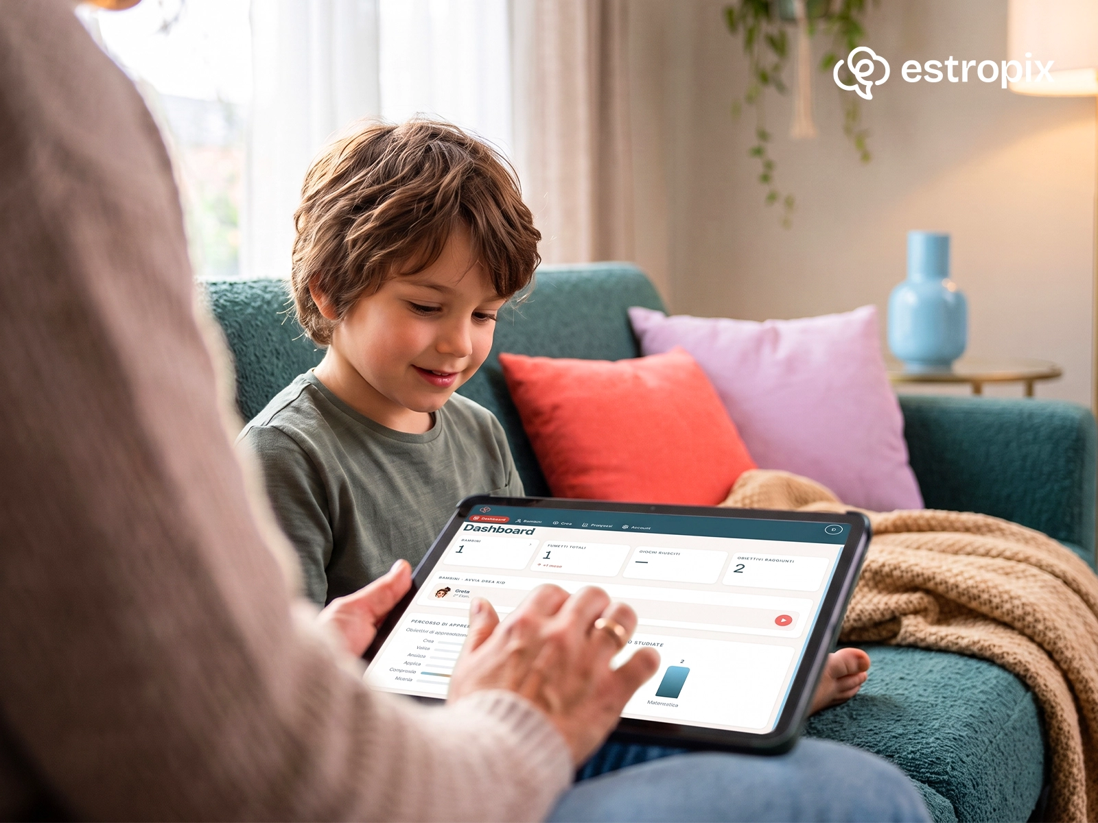
Once the mark was approved, the system extended into a full design language for the web app: light backgrounds paired with dark primary actions, a recurring single-stroke curve as a background motif, and a typographic scale from H1 to H4 built to stay legible for both children navigating the app and parents reviewing it.